Simplifying Sustainable Shopping.
In 2022, I created an ecological shopping cart concept designed to help supermarket shoppers make more sustainable choices. I’ve summarized this extensive school project to give you a clear idea of my design process.
Overview
Discipline
UX Research, Interface Design, Usability Testing
Project type
5th School Project (Year 2)
Team Project
Tools
Figma, Miro
Role
As a researcher, I interviewed supermarket managers as well as customers to gauge how much they were currently engaged with sustainability. Later in the project, I set up and conducted usability tests.
As a designer, I created the interactive prototype and translated the test results into design solutions.
Problem
Encourage the target group to make more sustainable choices through subtle hints, while still highlighting cheaper options and promotions.
The client aims to reduce CO2 emissions. However, some current supermarket visitors are slightly annoyed with how heavily sustainability is being pushed. They also perceive sustainable products as expensive, making them less likely to purchase these items during tough financial times, even though they may occasionally have the desire to do so.
Solution
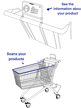
A smart shopping cart that unobtrusively helps customers make more sustainable choices through a screen and scanner attached to the cart.
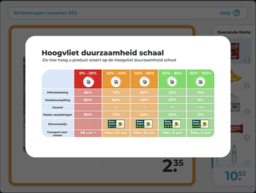
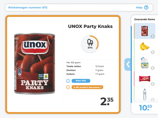
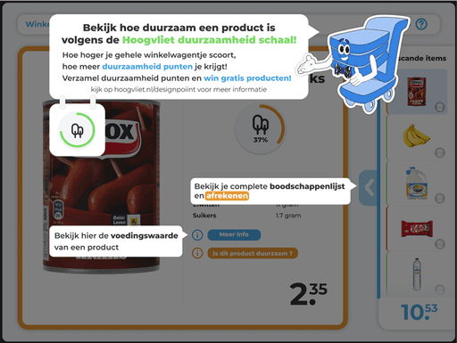
When the user adds a product to their shopping cart and scans it (using the built in scanner), the product appears on the screen along with its nutritional value and our "Hoogvliet sustainability scale." This scale indicates the sustainability of the product based on a simple diagram that can also be displayed with the press of a button. The user sees the scale color-coded as red, orange, or green (from red: not sustainable, to green: sustainable). Purchasing more sustainable products nets you more points, which can later be exchanged for rewards.
Research fase
The client emphasized the importance of making supermarkets more sustainable. It was our task to come up with a solution for Hoogvliet. At that time, Hoogvliet wasn’t doing much to promote sustainability, as I discovered through desk research and interviews with supermarket managers.
Our target audience consisted of 25- to 30-year-old adults on a budget, as sustainability and a greener planet are particularly important to the younger generation.
Hoogvliet wants to be known as an affordable supermarket, and the target group indicated in research that they didn’t have much to spend. Therefore, highlighting cheap products and promotions became an important design guideline for us.
Ideation
After defining the problem by rephrasing the design question, creating personas, and developing insight cards, we moved on to ideation. Through various brainstorming methods, three concepts emerged:
A smart shopping cart that provides sustainable information about the products in your cart.
An experience box, where users can see and experience the consequences of an unsustainable lifestyle.
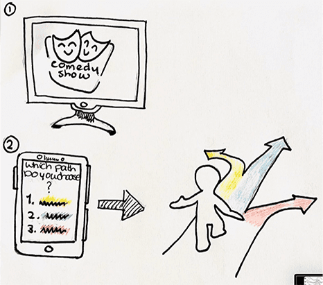
An interactive TV show, where viewers use an app to decide whether the characters on screen make (un)sustainable choices and see the outcomes of those decisions.
Choosing a concept
After presenting the research insights and concepts to the client, it was decided to proceed with the smart shopping cart. Concept 2 (experience box) was deemed too negative, and concept 3 (interactive TV show) wasn’t clear in terms of its purpose. We where instructed to focus on informing the target group and to prioritize what they valued most; buying affordable healthy products.
Iterations
Low fidelity
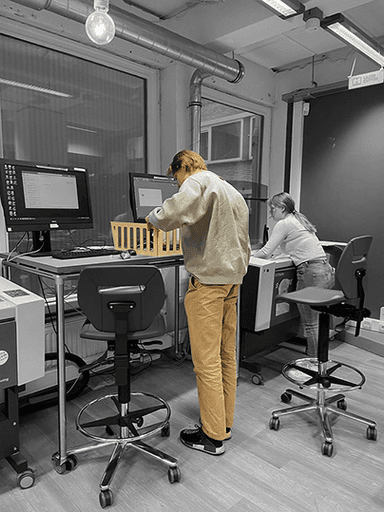
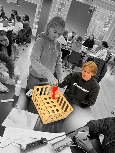
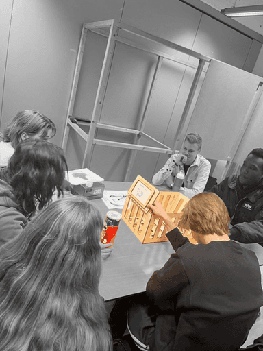
To quickly and easily test the concept, I built a paper prototype. Using the school's laser cutter, I created a wooden shopping cart and hand-drew screens on paper, which I then manually swapped out. My main goal was to determine if the concept was clear and if the first version of the user journey was well understood.
After testing, the concept was generally well-received, with only a few improvements needed for the screens themselves. There were questions about how the checkout process would work, and certain buttons were unclear. To address this, I explored mental models and incorporated familiar elements for the target audience into later prototypes.
Mid fidelity
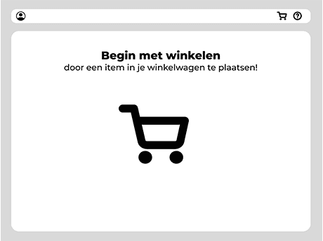
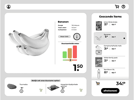
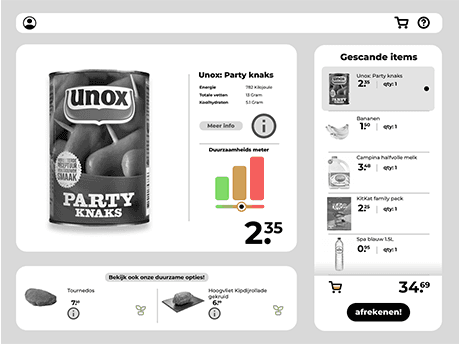
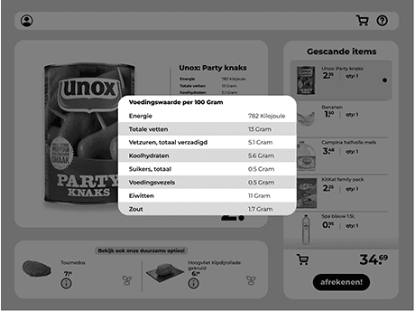
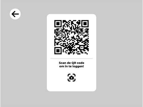
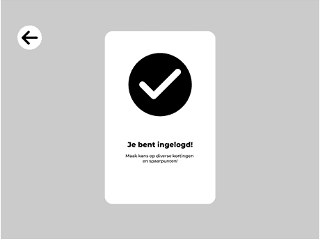
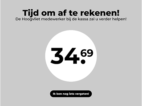
For the mid-fidelity prototype, I started working in Figma, visualizing different ideas within our concept in order to test them. This included features like a login function to earn points for rewards, which later evolved into a digital receipt. We also explored showing sustainable food options at the bottom of the screen, but this was not received well in testing. However, the overall flow and features, such as quickly viewing nutritional values, were very well received. After testing various ideas and layouts with our target audience, we were ready to move on to our final designs.
I took the lead in creating the visual aspect of this project. While our team collaborated during the low- and mid-fidelity stages to define the layout based on test results and interviews, I was solely responsible for the high-fidelity prototype and final version. I built everything from individual components to my own mini design system.
At the start of this project, I wasn’t very familiar with Figma, but over the months, I’ve truly mastered the tool.
Hoogvliet Style
Since this concept was developed for the Hoogvliet supermarket chain, aligning with their existing style and branding was essential. Although I couldn’t find an official style guide or marketing kit, I sourced materials from their website and offline channels. I created a style guide based on key elements, extracting colors and fonts directly from the website’s code using the 'inspect element' feature.
Final design
As I mentioned before, our concept encourages the target audience to make more sustainable choices through subtle prompts. This is achieved via a screen attached to the shopping cart, enhancing the overall shopping experience.
Building on this, when a user adds a product to their cart and scans it with the built-in scanner, the product appears on the screen alongside its nutritional information and our custom "Hoogvliet sustainability scale." As you can see in the image below. This scale visually represents the sustainability of the product using a simple, color-coded diagram: red for unsustainable, orange for moderate, and green for sustainable. With the press of a button, users can view more detailed information on the product’s sustainability.
Additionally, both the screen border and the product in the shopping list change to match the corresponding sustainability color.
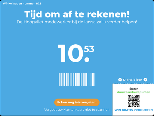
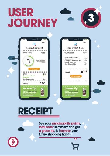
When the user is ready to check out, a digital receipt is offered, serving three purposes: it’s more sustainable, and it provides tips on improving sustainability: the receipt highlights the least sustainable product and suggests alternatives. Finally, the digital receipt is how users receive their reward points, based on their final average score.
We call these reward points "sustainability points," earned based on the customer's overall score. For example, if their cart is 50% sustainable, they receive 50 points, which can later be redeemed for free products. This gamified system encourages customers to aim for higher sustainability scores on future visits. The concept is explained clearly to users on the "help" screen. We envision Hoogvliet integrating this idea into their broader marketing campaigns as well.
As mentioned above, I also created a helpful pop-up featuring Hoogvliet’s old mascot from the 90's to guide users through all the features.
Results
Outcome
Encouraging users to think more sustainably while shopping.
With this concept, more people will be motivated to make sustainable shopping choices. Our research showed that the target audience is drawn to discounts and promotions, which we addressed by offering rewards for achieving a high sustainability score. Additionally, the smart cart provides convenient access to nutritional information and has the potential to attract more visitors to the supermarket due to its unique and advanced features.
What I've learned
Keep testing your designs, even when you think everything is right. Users will keep surprising you with new insights.
By consistently testing with the target audience, I realized that co-creation is one of the most effective strategies in UX design to ensure that what you create genuinely meets the needs of the people it’s meant for.
Reflection
This project has marked a significant shift in my development as a designer, both in terms of technical skills and teamwork.
As I mentioned before, working on the eco-cart concept allowed me to truly immerse myself in design and testing, which I greatly enjoyed. My growth in Figma has been a highlight; I went from disliking the program to mastering it (and loving it!), leading the creation of our high-fidelity prototype.
I initially struggled with focus and time management, which affected some of my testing deadlines. However, by actively seeking out feedback and applying it, I improved my concentration and project execution. This experience reinforced how valuable feedback is for growth. Moving forward, I aim to maintain this momentum and continue refining my skills.
